CSS BEM Methodology for Beginners
Naming things is always hard in software development, and CSS classes are no exception. For small sites, of course, organizing your CSS styles is not that hard.
However, as projects grow larger and more complex, managing your code can easily become cumbersome. At this point, various methodologies has emerged to easily maintain large CSS codebases. Some of them are OOCSS , SMACSS , SUITCSS , and Atomic CSS.
BEM (Block, Element, Modifier) is one such methodology, offering a powerful naming convention for effectively naming your CSS classes.
How BEM Works?
BEM breaks down user interface components into three distinct parts:
-
Block: A standalone entity that is meaningful on its own. Blocks are independent, reusable components of a webpage. Examples include: header, list, menu, form
-
Element: A part of a block that has no standalone meaning and is semantically tied to its block. Elements refer to parts of a block with a specific function. Examples include: header title, list item, menu item, form input
-
Modifier: Modifiers indicate different states or variations of a block or element. Examples include: checked, disabled, size big, color primary
How BEM Structure CSS Classes
The BEM naming convention structures class names using a combination of three components—block, element, and modifier—along with underscores and hyphens as shown below:
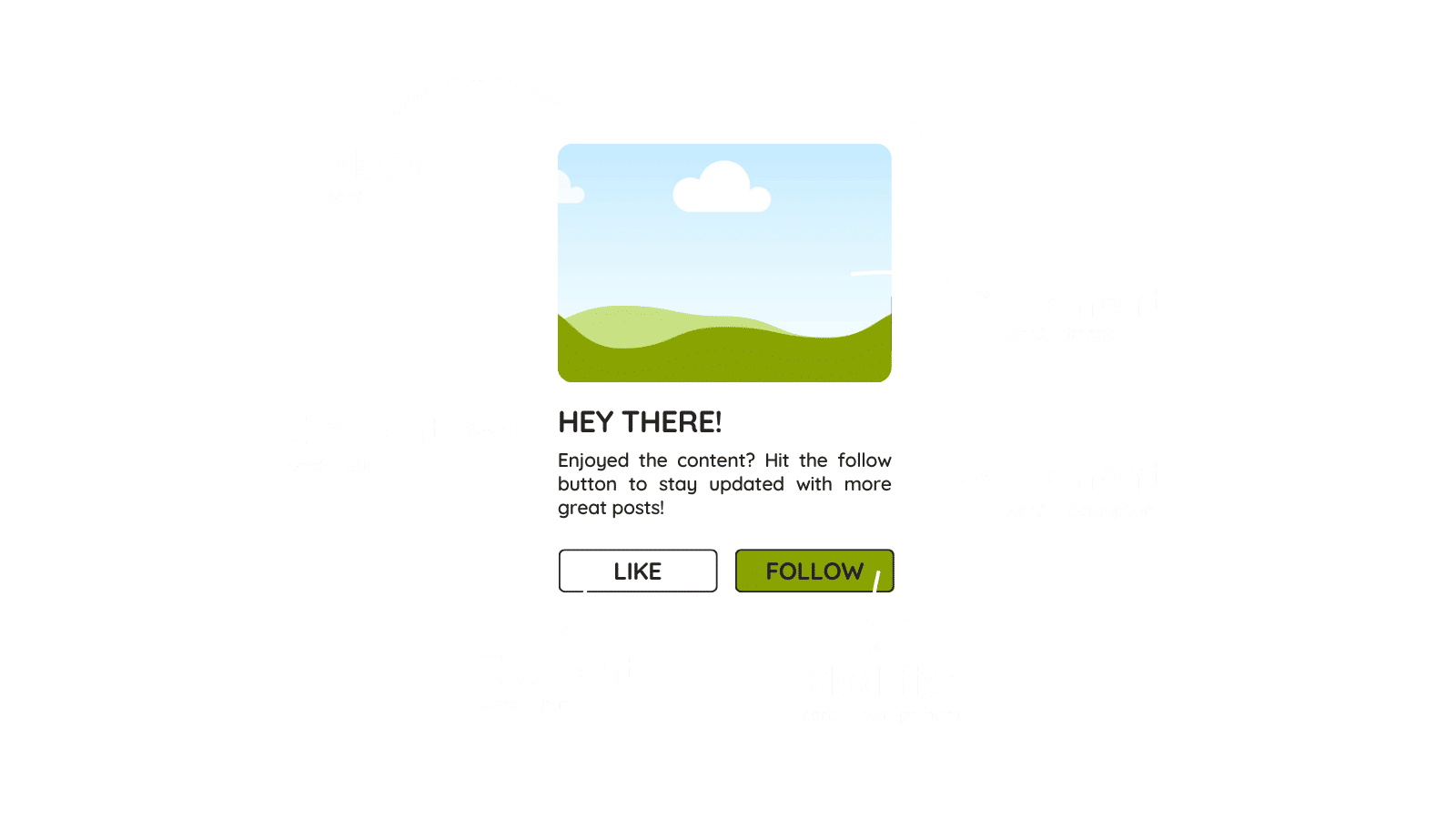
Suppose you have a card component in your application and want to use BEM for naming its classes. In this case, your card component and its BEM structures might look like this:

In this component,
- the card is the block,
- the image, description, title, and button are the elements of that block,
- the color variation named primary is considered a modifier.
Following the BEM class structure, the HTML for this card component would look like this:
<div class="card">
  <img class="card__image" src="path/to/image.jpg" alt="Card Image">
  <div class="card__content">
    <h2 class="card__title">HEY THERE!</h2>
    <p class="card__description">
      Enjoyed the content? Hit the follow button to stay updated with more great posts!
    </p>
    <div class="card__buton-group">
      <button class="card__button">Like</button>
      <button class="card__button card__button--primary">Follow</button>
    </div>
  </div>
</div>
I want you to pay attention to the hierarchy here. As you may notice, .card__content and .card__button-group are also elements of the card block. These are good examples in showing that
- Elements can be nested within each other as blocks.
- When you have two or more words in a name, you use single hyphen to separate the words — not camelCase, snake_case, or spaces.
Styling BEM Components with SASS
SASS is a powerful CSS preproccesor that adds powerful features to regular CSS, such as nesting, function, mixins, and more. Styling BEM components with SASS becomes much easier thanks to its nesting capabilities and the parent selector. Take a look at the following snippet.
.card {
  background-color: #fff;
  border-radius: 12px;
  max-width: 400px;

  &__image {
    width: 100%;
    height: auto;
  }

  &__content {
    padding: 1.5rem;
  }

  &__title {
    font-size: 1.5rem;
    margin-bottom: 0.5rem;
  }

  &__description {
    font-size: 1rem;
    margin-bottom: 1.25rem;
  }

  &__buton-group {
    display: flex;
    gap: 0.5rem;
  }

  &__button {
    padding: 0.5rem 1rem;
    background-color: #fff;

    &:hover {
      background-color: #eee;
    }

    &--primary {
      background-color: #3498db;
      color: #000;

      &:hover {
        background-color: #2980b9;
      }
    }
  }
}
In SASS, the parent selector is represented by the ampersand (&). It refers to the current selector at that level of nesting. The & lets you:
- Build BEM elements and modifiers (like &--image or &--primary)
- Write pseudo-classes (&:hover, &:focus)
FAQ
Can blocks and elements be nested within each other?
Yes, both blocks and elements can be nested within each other. This allows you to build complex structures.
How to separate multiple words in a block or element name?
When you have two or more words in a name, you use a single hyphen to separate the words — not camelCase, snake_case, or spaces. For example, .menu__list-item--checked
Can modifiers be used on both blocks and elements?
Yes, modifiers can be applied to both blocks and elements.
Should elements be used outside of their block?
No, elements should always be used within their corresponding block.
Conclusion
As we conclude this article, it’s important to note that while the BEM methodology offers a solid approach for naming CSS classes, it’s not the only option. Using BEM may have its pros and cons depending on the nature of your project and the preferences of your team.
Thank you for reading!